20 Deep Winery Blending Creativity & Commerce
Branding a new winery rooted in expertise, pride, and craft.
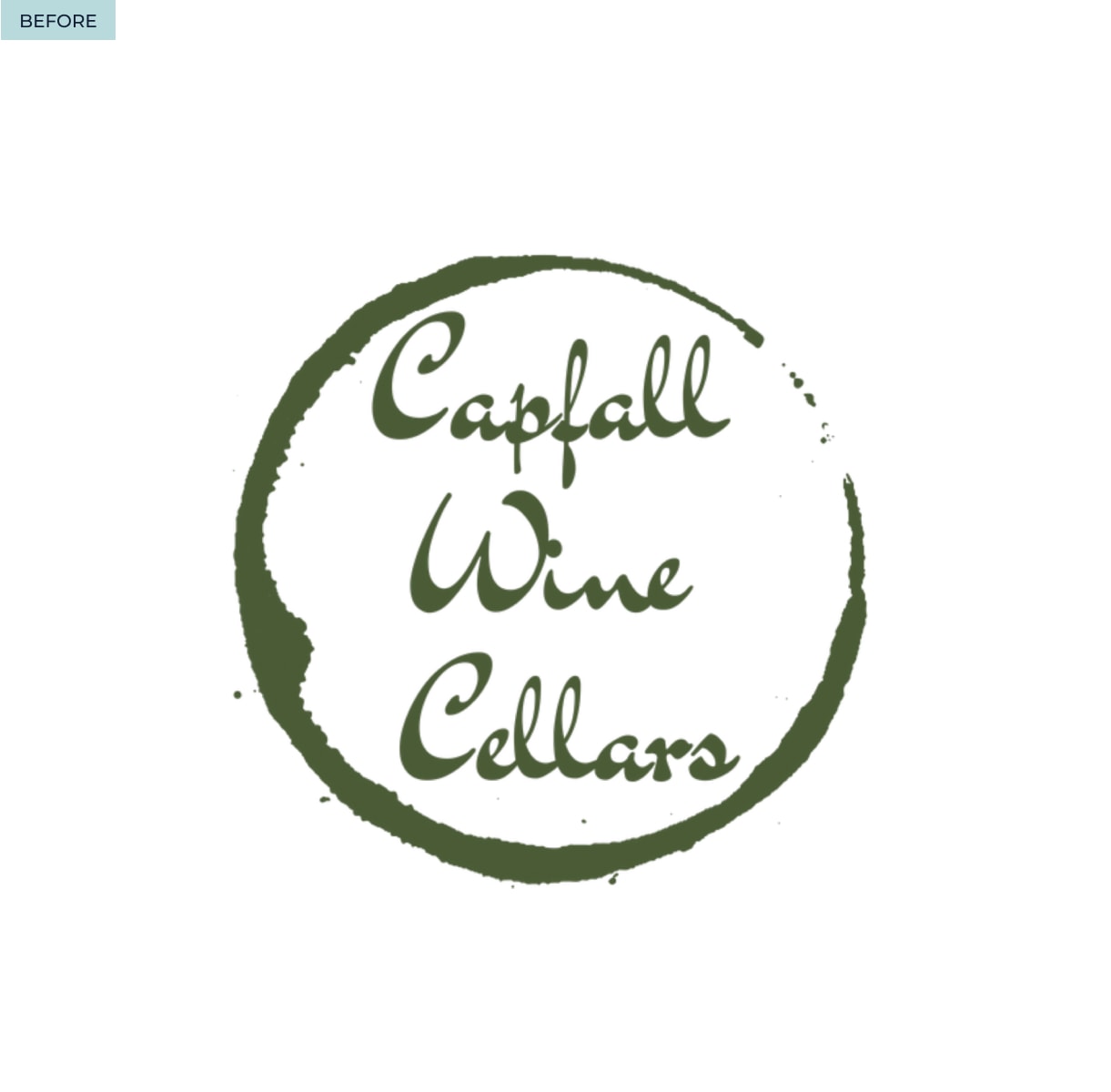
From
“Vines and a Vision” needing to claim its place in the established Finger Lakes wine region.
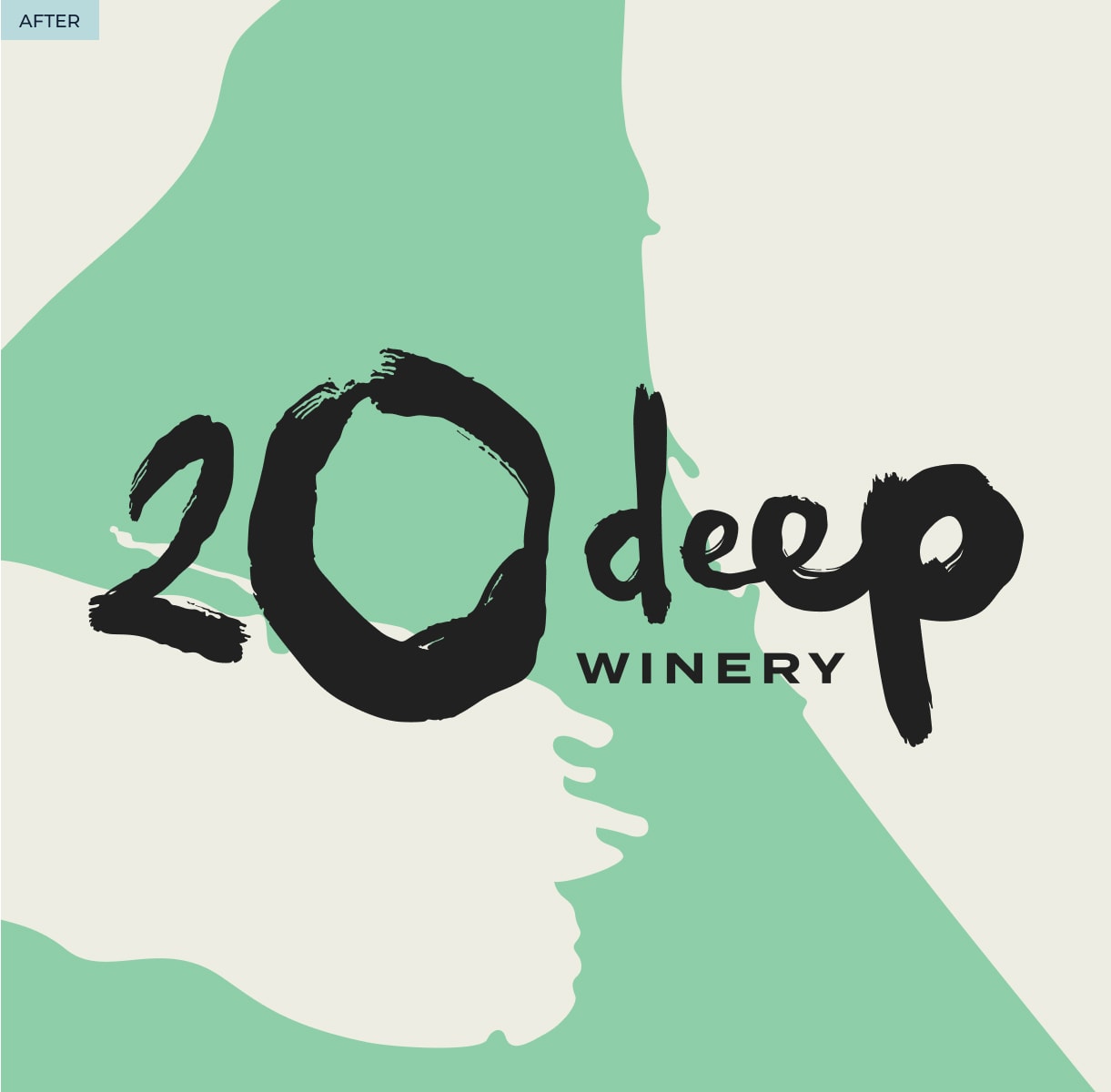
To
A one-of-a-kind brand and winery experience that challenges traditional winery vibes.
By
Building a brand that embodies an ethos that wine is best enjoyed in a chill, fun, down-to-earth environment with great people.
- Naming
- Logo Development
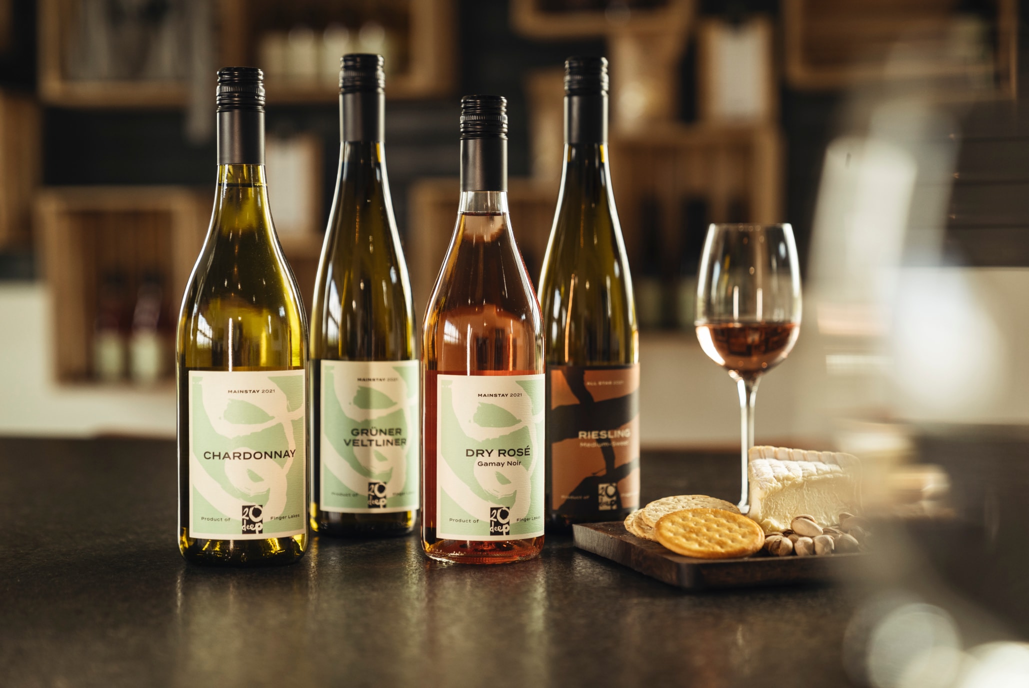
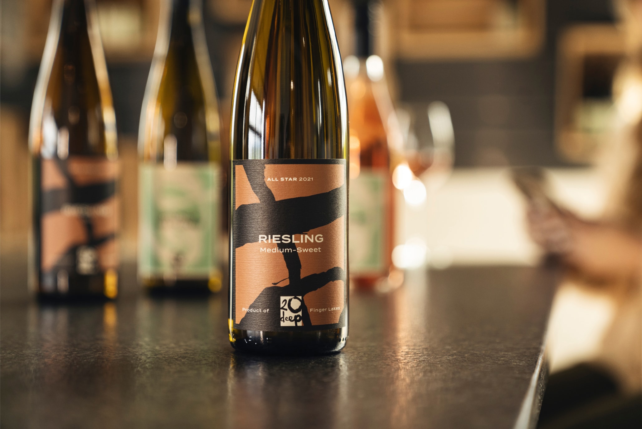
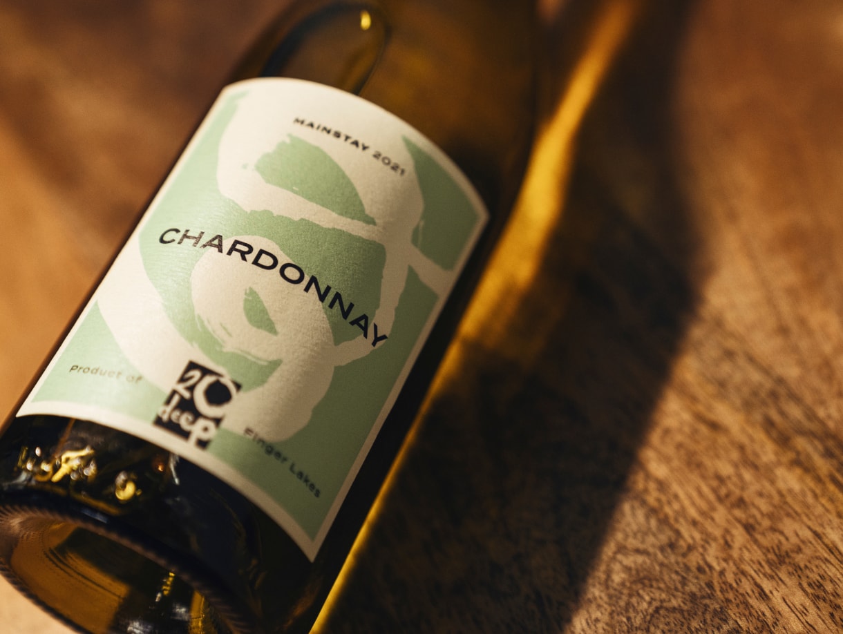
- Packaging
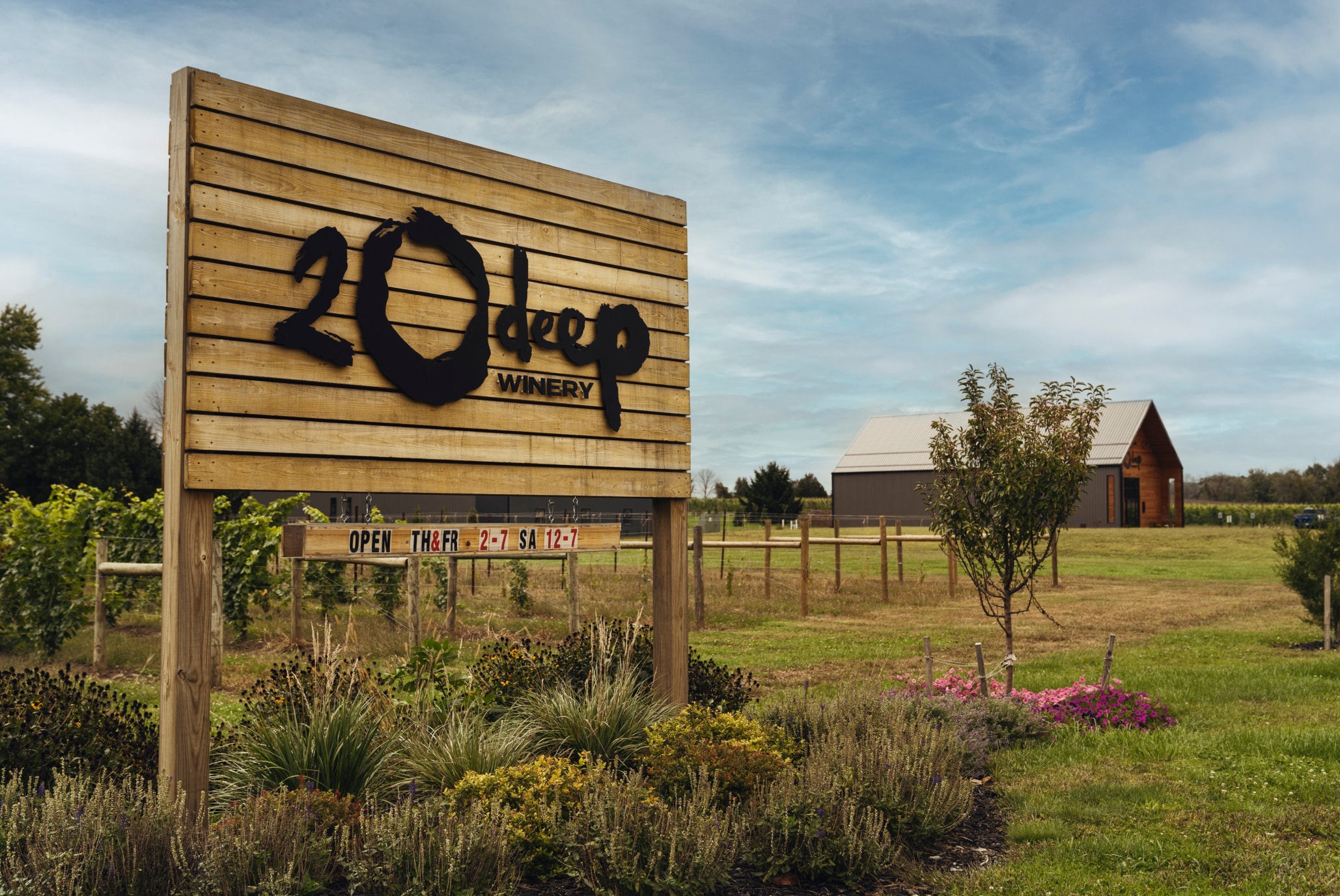
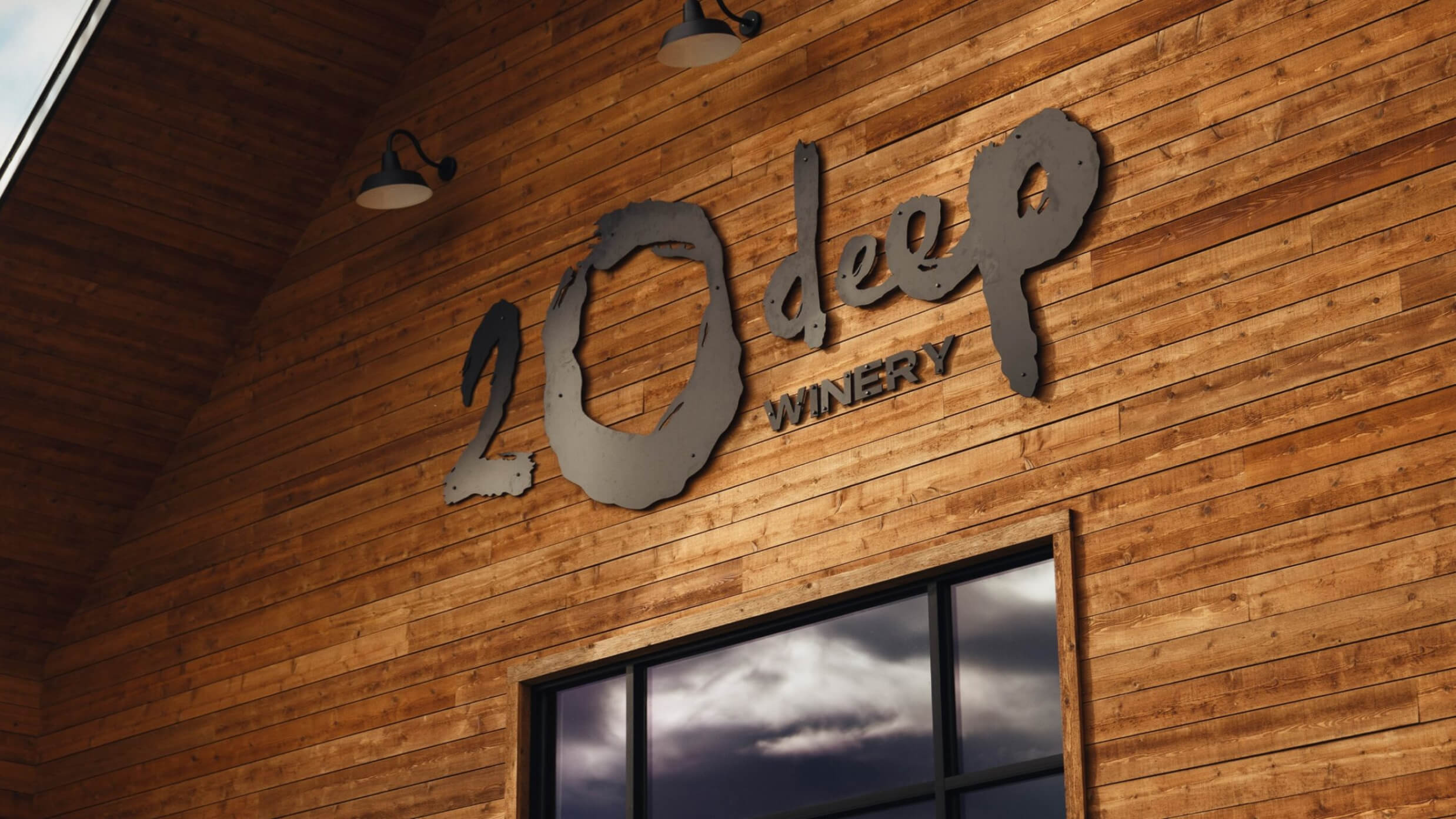
- Environmental Design
- Signage
- Point-of-sale
Branding a new winery rooted in expertise, pride, and craft.
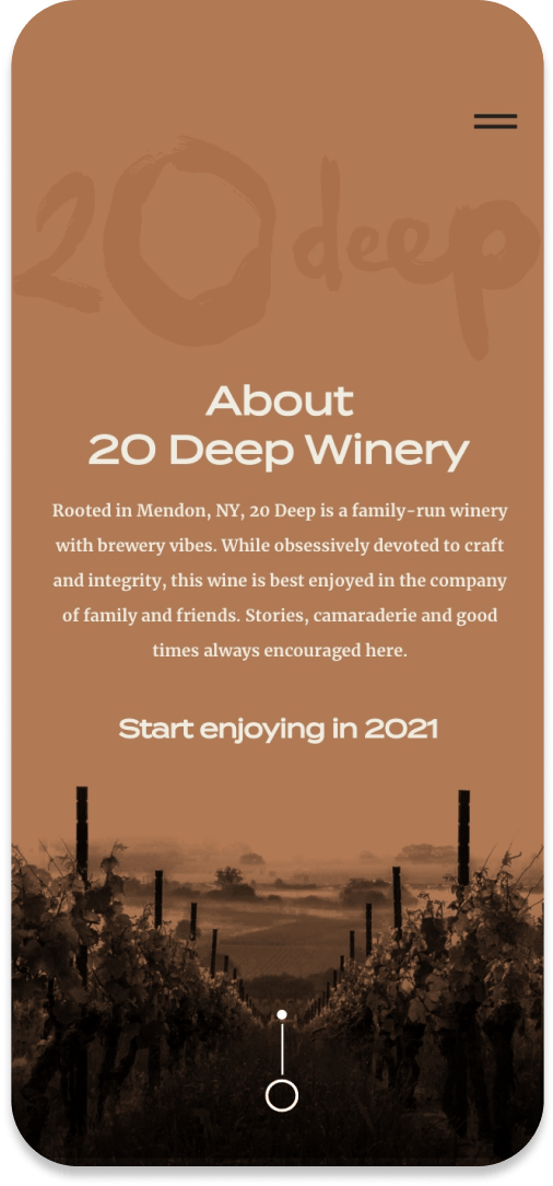
The Finger Lakes wine region has no shortage of wineries that feel like, well, wineries. You know—sniff, sip, spit. The founders of 20 Deep had a different vision and ethos for theirs. A whole new vibe for a winery that would draw in not just wine connoisseurs but also beer lovers, wine novices, and even families. They wanted to be casual, comfortable, and friendly, yet obsessively devoted to craft and integrity. And while they want national recognition, they take a lot of pride in being rooted in Mendon, NY. From that, the name 20 Deep was born.
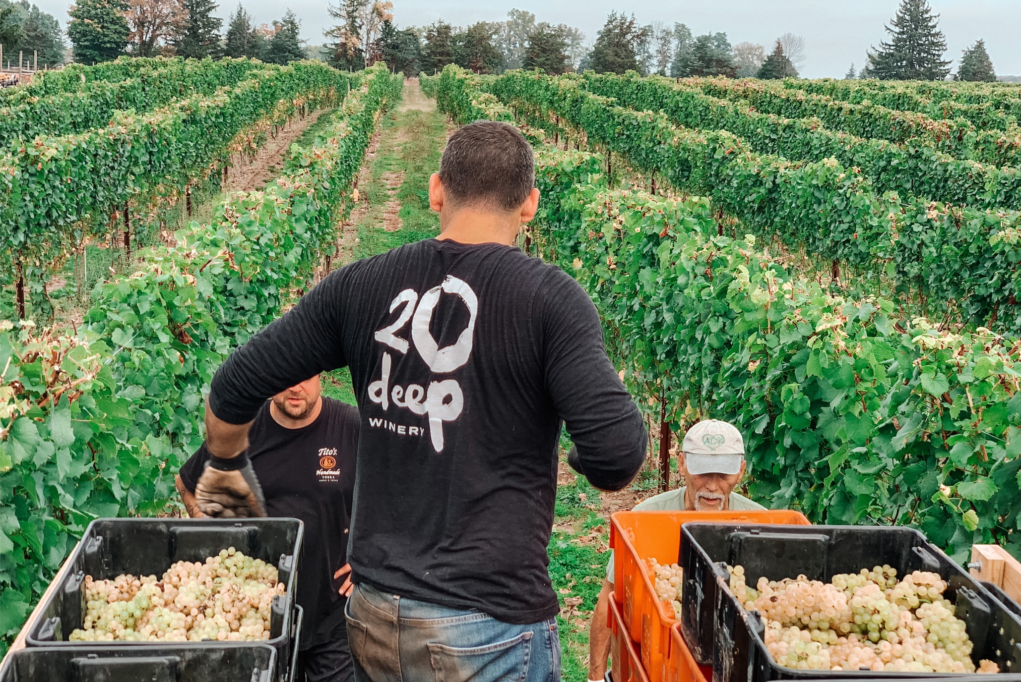
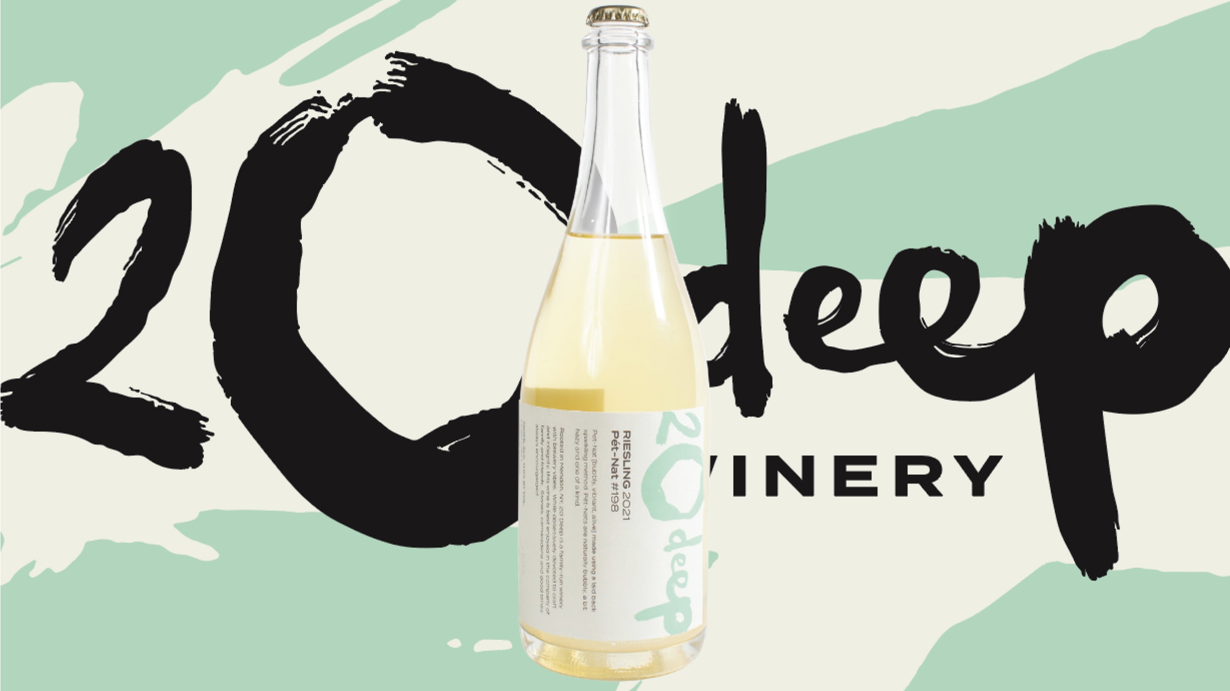
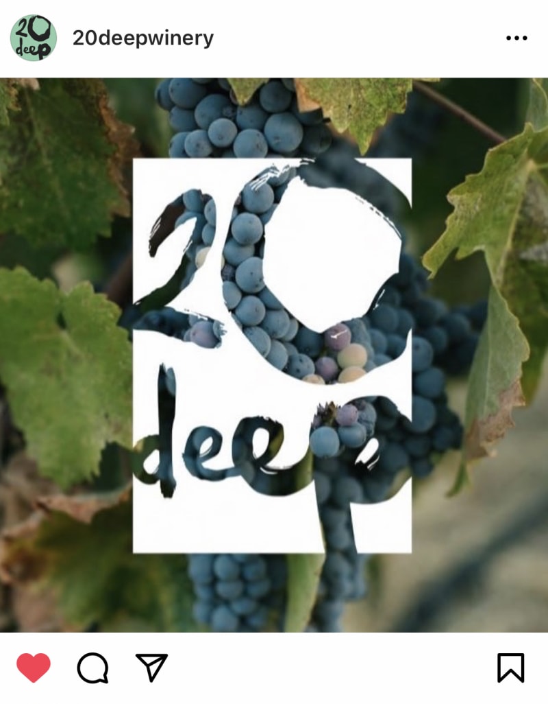
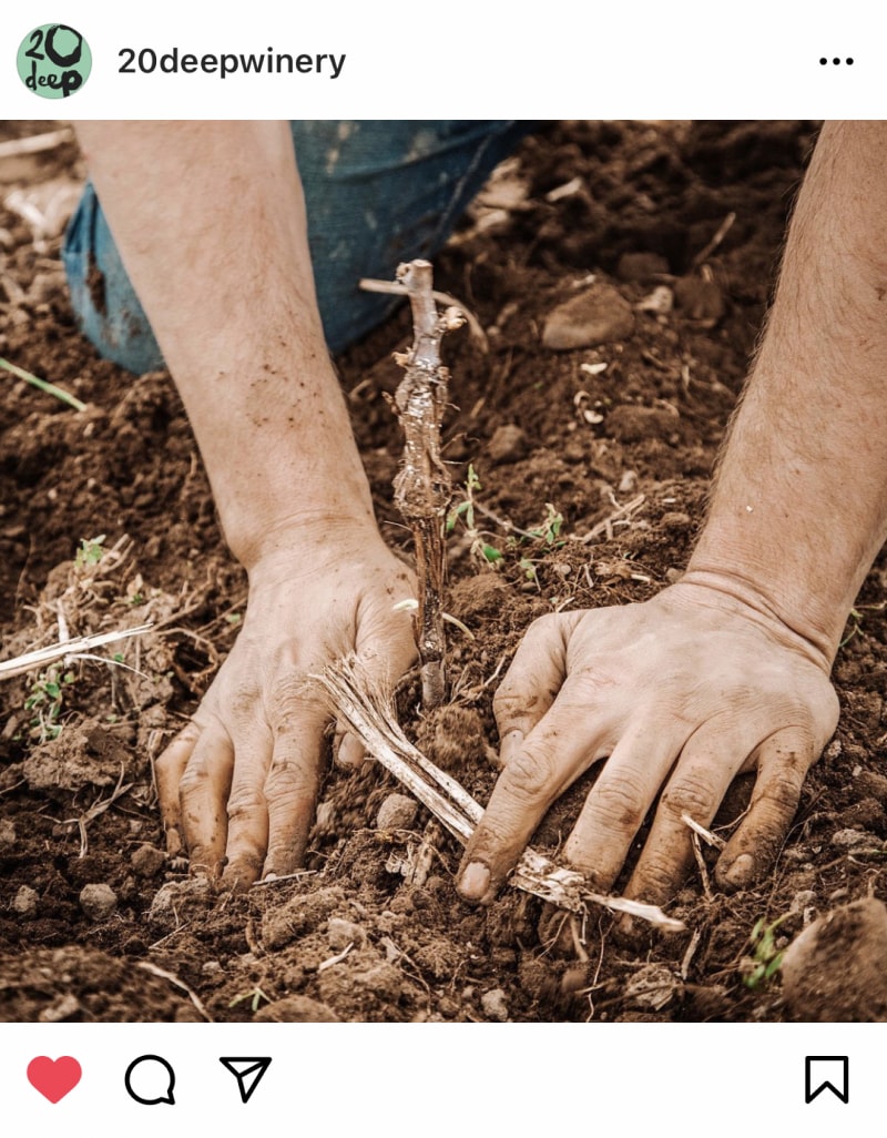
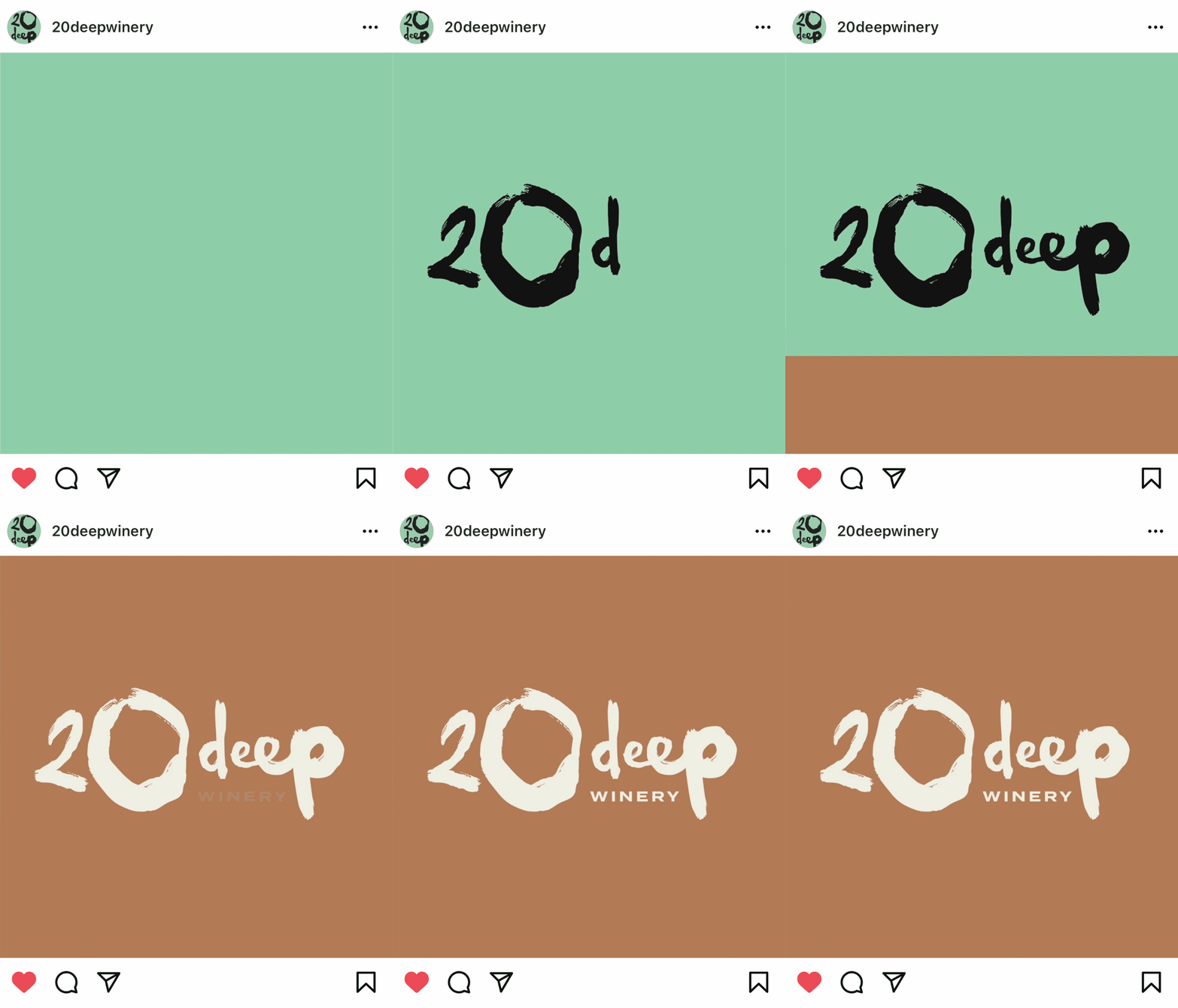
On the surface, the name “20 Deep” has pretty literal origins that wine-making experts would know while making everyone else curious. Grapevines grow 20 feet into the ground—a true testament to the winemakers’ commitment to their community and the people there. The logo brings forward the raw nature, handmade quality, and creative process of making wine in a relaxed, welcoming way.
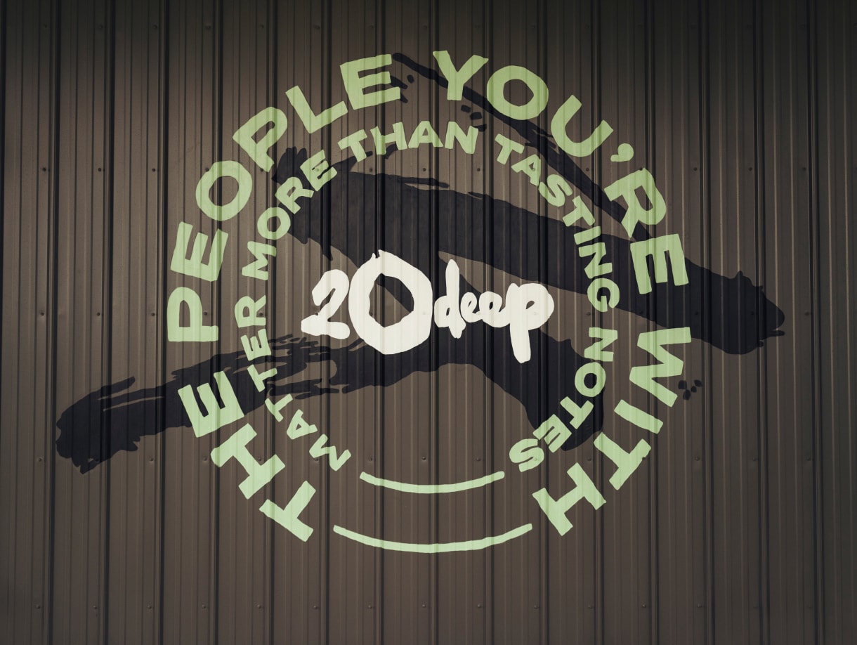
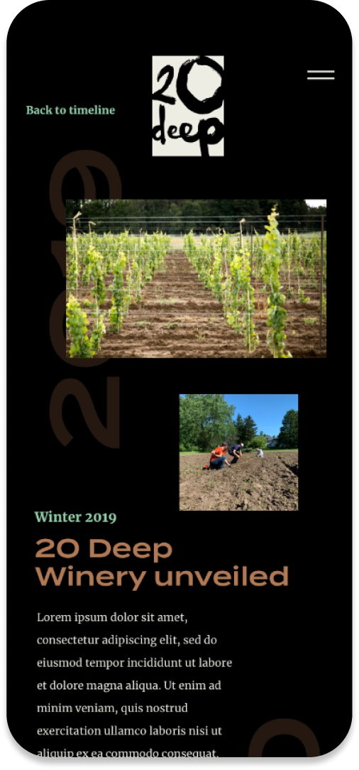
We extended the handmade character of the brand through touchpoints like signage, packaging, menus, mural art, point-of-sale materials, and product portfolio naming—bringing the 20 Deep customer experience to life through brand interactions big and small, all in a way that feels perfectly imperfect.

Awards & Recognition
2023 GRAPHIS Design Awards
Brand Identity Silver
2020 Rochester American Advertising Federation (AAF) Awards
Brand Identity Silver

