Telesca Center for Justice A Meaningful Rebrand
Social impact for an enduring, stable community.
From
A solid & prosaic legal icon.
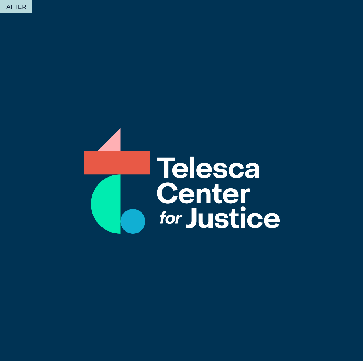
To
An inspiring creator of a better community.
By
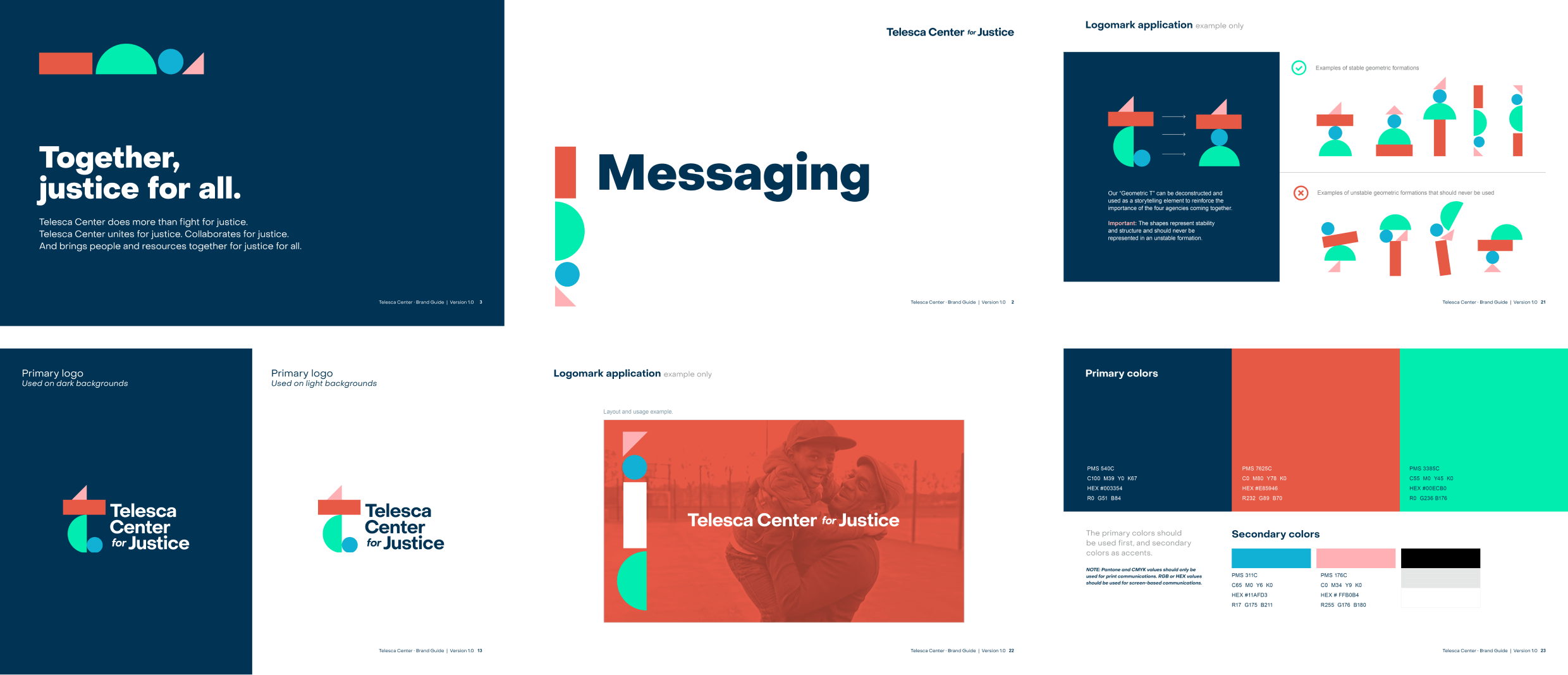
A new visual identity that creates a sense of what their four core organizations can achieve together.
- Brand Strategy
- Logo Development
- Design System Development
- Brand Playbook
Social impact for an enduring, stable community.
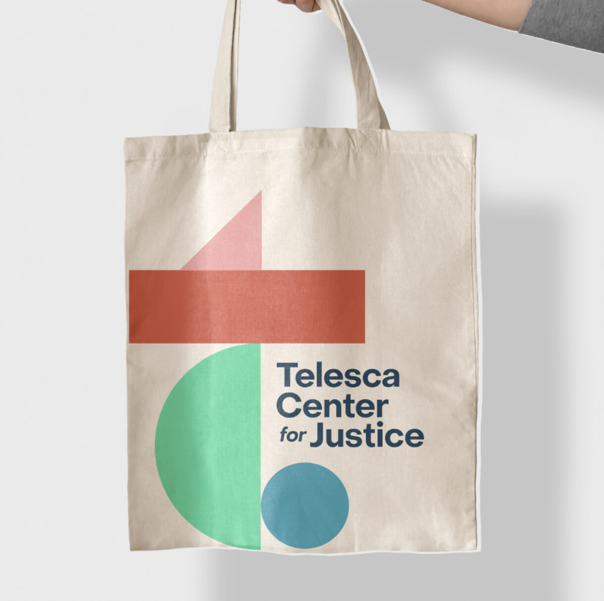
The new logo for the Telesca Center for Justice symbolizes a revolutionary approach in the legal sector, uniting four legal organizations to foster a safer, more stable community through collaborative efforts and equitable justice. This rebranding transitions from a conventional identity to an inspirational, versatile visual system, featuring four vibrant geometric shapes that represent the collective strength and flexibility of Telesca’s model. Aimed at communicating warmth, hope, and trust, the design also seeks to engage philanthropists and the broader community, blending a vibrant color palette and approachable typography to invite participation and support.
