Craft Beer Branding in 2024: Six Design Trends Cracked Open
Imagery by Jack Connolly / IG: @jackfromnova_1
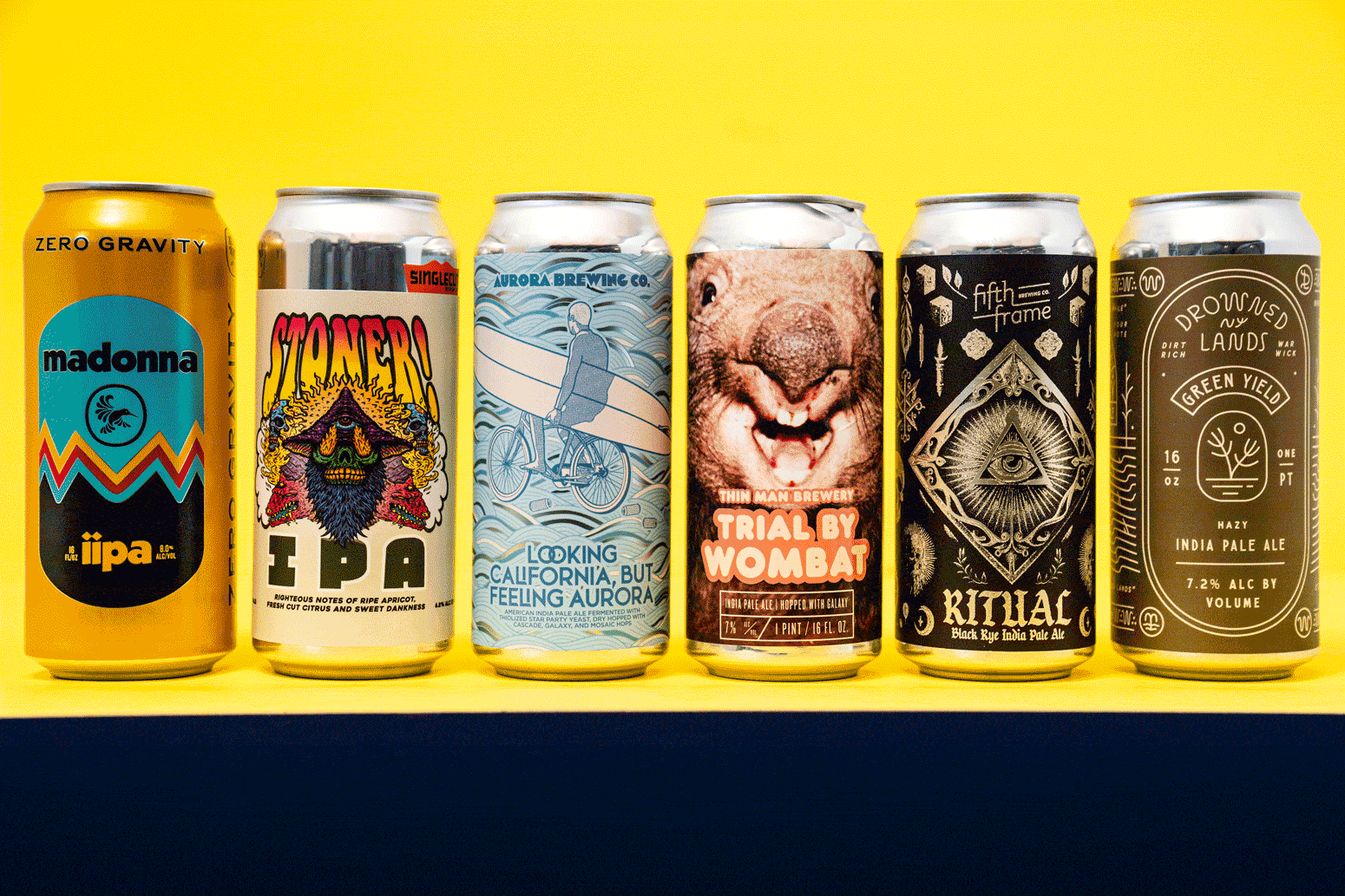
Craft beer isn’t just the hoppy beverage you choose for a bit of street cred with your buddies; it is now a canvas for bold statements and creativity. And nowhere is this more evident than in its can and label designs. The craft beer industry has embraced an array of artistic styles to help them stand out in a market suffering from sluggish sales,* while having to compete for attention on increasingly packed shelves of beer aisles and in coolers at retail. Savvy brewers appreciate that they have to be distinctive and make consumers feel something about them. This calls for risk taking and bravery regarding what’s IN their cans in terms of ingredients, recipes, and processes, and what’s ON their cans as a purposeful expression of what they stand for. Here are six standout design trends of craft beer labels I’ve seen on shelves here in Western New York.
*Beer Marketers Insight (BMI) report says Americans’ 2023 beer consumption was at its lowest point since 1999.
Ride The Beer Can Time Machine.
Nostalgia is a powerful tool. Craft breweries have been tapping into it, with vintage-styled labels to evoke a sense of the past and reinforce a heritage for the brand, whether that brewery has been around for decades or just born from a new brewmaster’s most recent dreams. These designs often incorporate elements from the 1970s, 1980s, or even earlier, using vintage typefaces, muted color palettes, and old-timey illustrations.
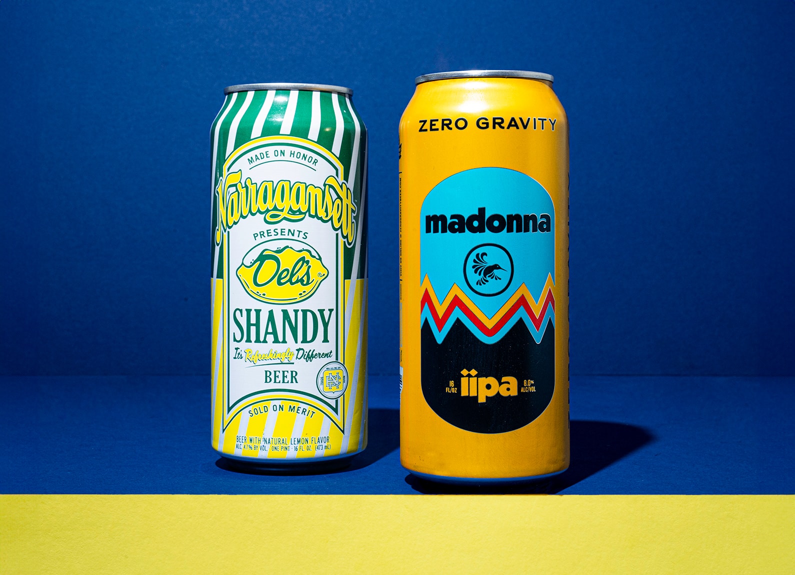
This trend connects with consumers on an emotional level, reminding them of simpler times and classic aesthetics. Vermont’s Zero Gravity Brewery captured the flat color-block style that permeated 70s design on everything from wallpaper to TV and from movie titles to skiwear. Narragansett Brewing’s Del’s Shandy Beer even goes a step further to trade on nostalgia by parodying old lemonade packaging and signage from county fairs and beachside lemonade stands. The result is a label that not only looks timeless but also evokes fond memories of summertime treats and childhood adventures.
Get Trippy With It.
Bright, swirling colors and mind-bending patterns and illustration define this more specific retro trend, “psychedelia,” referring to the hippie counterculture movement that permeated the music, art, fashion, and, well, drug culture of the 1960s. Psychedelic imagery often includes bold, vibrant hues and intricate designs that seem almost alive. References to peace signs, flower power, free-spirited people, and hippie iconography are common, creating a label that’s both eye-catching and evocative of the era’s rebellious spirit.
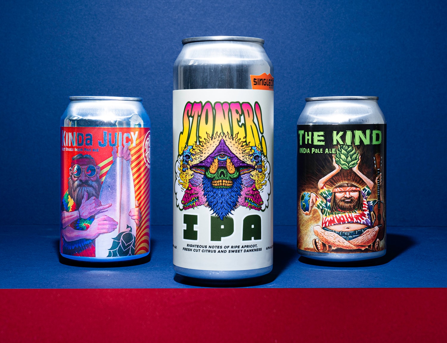
Sierra Nevada’s Cosmic Little Thing IPA features a trippy astronaut surfer illustration, blending surreal space and surf culture in a vibrant, eye-catching design. Similarly, our neighbors at Three Heads Brewing embrace stylized Dead Head character illustrations for beers like The Kind IPA, featuring intricate, colorful artwork that evokes the spirit of 60s hippies and their counter cultural ideals, epitomized by bands like The Grateful Dead.
Plus Your Minimal Instincts.
Minimalism has been a steady trend in various design fields, and in craft beer, it’s about more than just simplicity and limited, often delicate, design cues. Minimalism Plus takes a similar, reductive, minimalist approach but pushes it further to incorporate thoughtful design elements that add depth to the visual presentation and branding. Think clean lines and ample negative spaces. Yet upon further investigation, you may find intricate patterns, textures, and illustrative elements that don’t overwhelm but rather enhance the design.
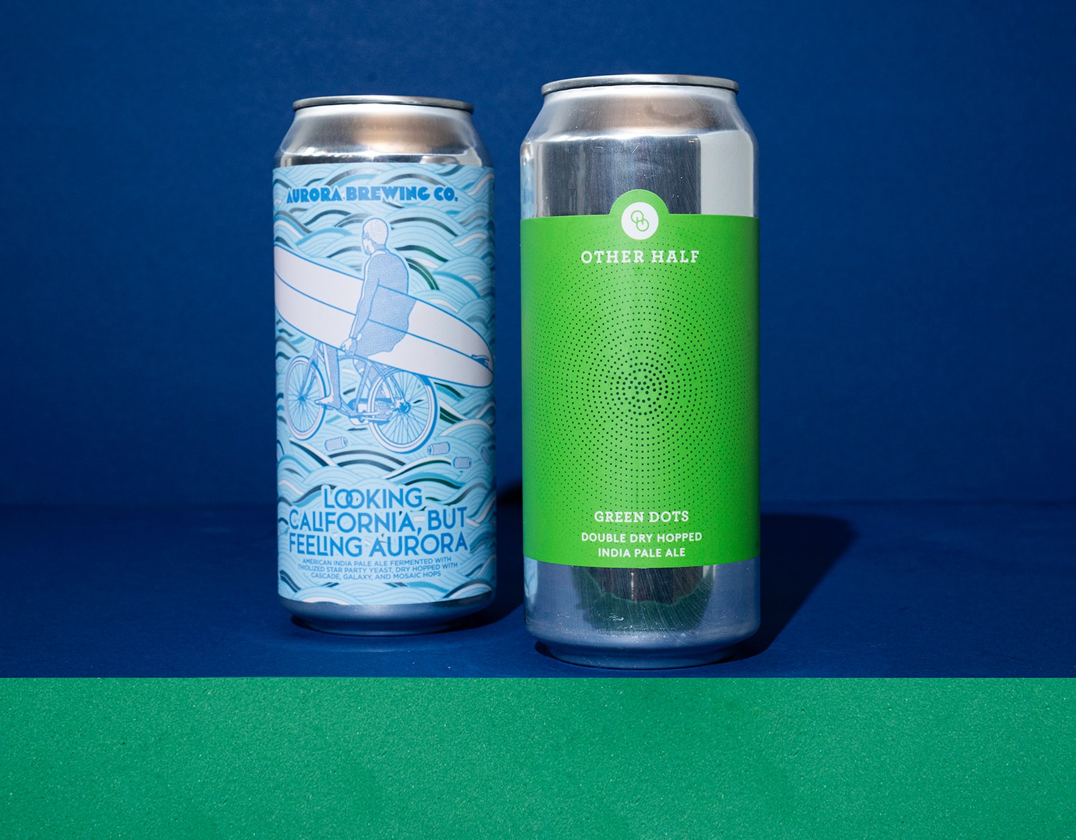
This style exudes sophistication and elegance, often appealing to those who appreciate an understated beauty. An example is Other Half, a brewery known for its minimalist yet striking label designs. On the other hand, Aurora Brewing’s intricate illustrative labels using monochromatic color palettes and refined typography create a sophisticated expression without overloading the craft beer consumers’ senses.
Turn Your Design Up To 11.
On the opposite end of the spectrum is maximalism, a trend that embraces a “more is more” mentality. These labels are often crammed with dense, elaborate artwork that can include anything from layered illustrations to patterns, color, and multiple typefaces. Some might dismiss this approach as a blatant attempt to draw the attention of consumers by screaming at them from the beer cooler shelf. But there may be more intent to this shock-and-awe design mentality than is first apparent. Let’s consider the influence of our always-on internet culture. Driven by today’s online lifestyle and its democratization of publishing and expression, rebellious and disobedient aesthetics permeate the internet.
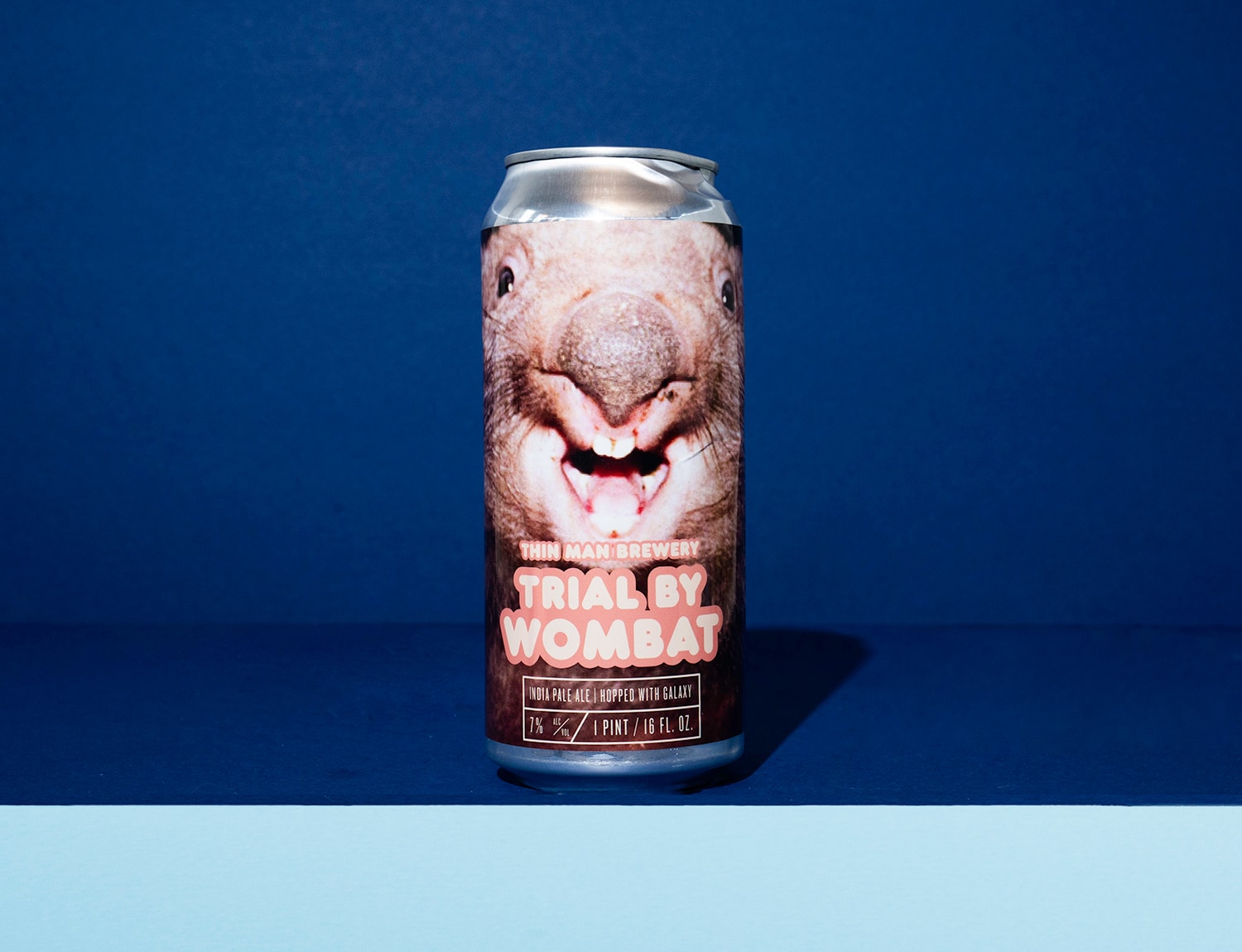
Tim Leake, an SVP at Los Angeles agency RPA, has illuminated the internet aesthetic in his talk entitled “Ugly Sells”.* He argues that much of the internet simply does not love and embrace overly produced, “pretty” design and precious imagery. Rather, memes are blunt, selfies are raw, content is purposely made to feel “authentic”— recall your feed full of unpolished edits, mobile phone-captured footage, chunky type, and irreverent graphics. Well, that content style is actually well-suited for today’s short attention spans and scroll-obsessed audiences. I believe breweries are leaning into maximalist design to reflect the eclectic, digital-age sensibility of today’s craft beer drinkers. Thin Man Brewery’s Trial By Wombat beer label is a perfect example, featuring its unique name and a tightly cropped photo of a wild marsupial (that has absolutely zero relevance with our region where Thin Man Brewery operates, BTW) to create a sticky, visual spectacle that is nearly impossible to ignore on the shelf.
*Ugly Sells was a well-regarded session led by Tim Leake at the Cannes Festival of Creativity in 2022.
Dance With The Devil.
For those who enjoy a touch of the strange and sinister, macabre design approaches commonly embrace the world of the occult and the forbidding symbolism of skulls, skeletons, monsters, the undead, and other dark fantasy elements. These labels often employ shadowy color palettes and gothic typography to create a sense of mystery and intrigue.
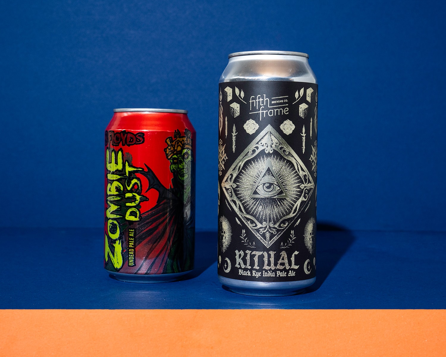
The imagery can be both haunting and mesmerizing, appealing to consumers who are drawn to the unconventional. Three Floyds Brewing has made a name for itself with its dark and intricate label art for beers celebrating zombie lore that fits perfectly with its bold brews. Fifth Frame, a small- batch brewer across town from us, has created “Ritual” with a label that delves deep into mystical symbolism and haunting iconography that engages customers in a shadowy, yet alluring, narrative.
Walk The Line.
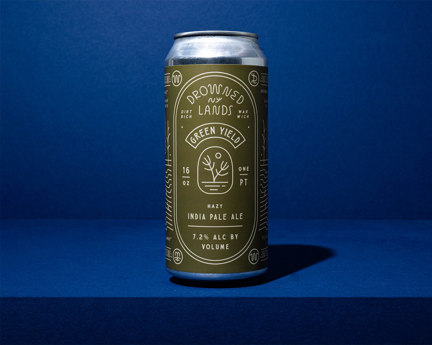
Monoline illustration is all about balance and precision, using single-weighted lines to create detailed and expressive artwork. It’s an execution worth noting as a design trend in craft beer branding, with an illustrative style that combines simplicity with complexity, producing labels that simultaneously feel both delicate and strong, modern and classic. The monoline style is versatile, capable of conveying anything from whimsical scenes and intricate patterns to simplistic iconography and symbols, all while maintaining a cohesive and clean look. Breweries like Drowned Lands and Mortalis here in New York are employing monoline illustration, giving their labels a unique and polished appearance.
The world of craft beer label design is as diverse and dynamic as the beers themselves.
From the nostalgic charm of retro and psychedelic designs to the bold statements of maximalism, the eerie allure of macabre imagery, and the sophistication of minimal plus and monoline illustration, these trends reflect the creativity and innovation driving today’s craft beer industry. As breweries push the boundaries of design to find braver expressions of their brands, consumers can look forward to an ever-evolving landscape of captivating and imaginative labels that enhance the drinking experience.
I’d love to know what design trends you’re seeing on your own region’s retail shelves and at your favorite microbreweries. Please share your observations with us. And if you want to take an even deeper swig of the beverage category with us, check out our new Six Pack of Beverage Trends article here.